Introduction
Human-computer interaction, as the name suggests, is the field which studies how people use technology. The field pays special attention to the design of interfaces between people, the users, and programming. The purpose of the following work is to present several key themes that the author feels have struck her most strongly over her introduction to human-computer interaction. These broad themes have been formed and informed by a semester’s worth of reading, discussion, and application, and are supplemented by ideas from all three areas. They are as follows: that a design should feel natural to its users, that designers make mistakes and so need to test their designs, that special attention should be payed to neutrality, that accessibility is empowering rather than burdening, and that unforeseen ethical issues to which the product contributed must be faced.
Make It Natural
Designing for people means making our products and programs as intuitive as possible to use. They can be fresh, and unique, but should never feel overwhelming and foreign. Achieving this can be deceptively difficult, since the designers are the ones who came up with their design’s intuition in the first place. For example, take the following story. The author is a designer for the application a2a. The a2a team wanted the application’s basic navigation system to have its own unique flair. Since our application is a multimedia art-sharing platform, we wanted our icons to be textless so that our users would not inadvertently distract themselves from the main works being shared by spending split-seconds reading buttons that said ‘Follow’ and ‘Like’. So, we decided to make the ‘Follow’ button an eye icon and the ‘Like’ button a heart. We also decided that a house icon to represent the ‘home’ or ‘main feed’ button was overdone, and instead opted to use an artist’s palette icon as our ‘home’ icon, to keep with the ‘art’ theme.
![]()
Fig. 1: a2a’s initial confusing icons
However, during testing, our users found these specific icons unintuitive and confusing because they could not discern the meaning of the eye and heart without explanation, and they had never seen an artist’s palette icon used in this context before. Ultimately, we ended up reverting to more standard icons because this is what users were already familiar with.
![]()
Fig. 2: a2a’s revised and improved icons
This design mistake taught us that there is often a good reason why certain symbols seem standard to use for one purpose or another. That users’ past experiences contribute to their preconceived notions of what a symbol means or what an aspect of the design does can be used to designers’ advantage. That is to say, if users see something that they recognize from real life or from past experience, they are likely to use that knowledge as they work to interpret the interface of a product that they are trying for the first time. Some examples of this are well-documented in chapter 7 of Saffer’s “Designing for Interaction” (link). For example, switches and toggles denote a binary choice, dials and sliders imply choices along a continuum, and blank boxes suggest user text input.
Accessibility Doesn’t Favor, It Enables
One thing to keep in mind while making a design natural is how to make it natural for all users. Typically, designers research the populations that they believe make up the average user of their product. However, this makes it very easy to neglect the needs of those who do not fall within those boundaries. It can seem like a hassle to designers to make ‘extra considerations’ for groups such as the visually impaired or the anxious. What many designers, including the author, never consider is that the average user could also benefit from accommodations for the disabled user. For example, the government of the United Kingdom has a set of guidelines for designing with accessibility in mind (link).
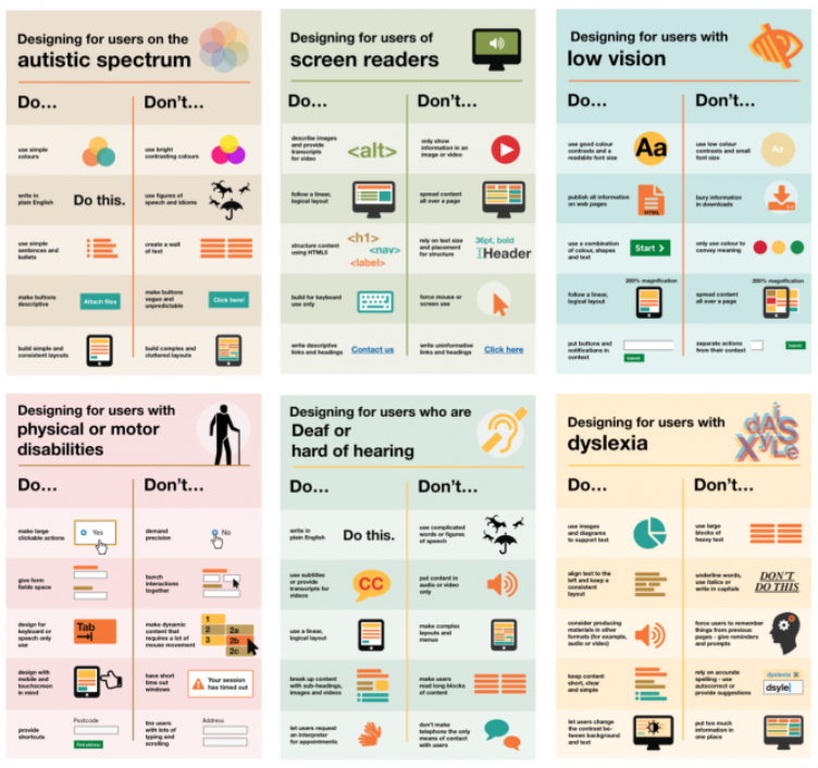
Fig. 3: low-detail overview of UK’s accessibility guidelines
Consider the following: Walls of text are not troublesome only to autistic users. The author, a probably neurotypical, also balks when confronted with walls of text and the potentially painful necessity to dissect it. Formatting a webpage such that it has a logical layout does not only help users who rely on screen readers – it saves average users a headache as well. Similarly, using fonts of readable size with good contrast saves the eyes of both low-vision and average users. Providing large, clickable actions is less frustrating for both the physically disabled and the average user. These are just some of the simple ways that designers can make their designs more accessible and natural to all users.
You Will Never Catch All Your Mistakes
Because making a design natural can be unexpectedly tricky, the best way to find out if it is as easy to understand and use as it was designed to be is to test it. One way to do this is through heuristic evaluations, a technique developed by the Danish web usability consultant Jakob Nielsen. Through research, Nielsen derived ten heuristics to which program interfaces can be quickly evaluated by designers, their associates, and even users themselves (link). These heuristics include ideas such as “visibility of system status”, “recognition rather than recall”, and “help users recognize, diagnose, and recover from errors”. While these may seem like basic characteristics of a user interface, they are remarkably easy to take for granted. For example, the a2a team ran afoul of the heuristic “consistency and standards” when we decided that we wanted to make our notifications section a speech bubble-shaped pop-up that would overlay the main screen when called from the main toolbar.
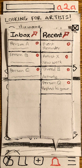
Fig. 4: a2a’s intial heuristic-violating notifications speech bubble
However, because every other screen which could be called from the main toolbar resulted in a completely new page, the pop-up notifications bubble read to our heuristic evaluator as violating “consistency and standards”. In hindsight, the design team completely agreed with that assessment and changed the pop-up to its own page.
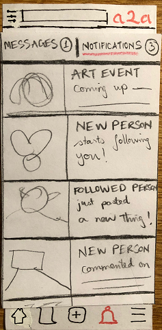
Fig. 5: a2a’s revised notifications page
Heuristic evaluations make excellent first checks to catch little slips and oversights. However, just because a design checks out in terms of heuristics does not necessarily mean that it is usable. So, it must be placed in front of real people, people who are unaffiliated with the project and who have no more background knowledge other than what the design is for. This way, the designers can see what parts of their work is natural and intuitive, and where users find working with the design confusing. For example, during the usability testing for a2a, our users discovered that they could view their portfolio once it had art files in it, but that there was no page to account for when the portfolio was empty. It turns out that we the designers had not considered that a user might look at their portfolio before they had begun to populate it. The fix was simple enough, but we probably would not have thought of this had our users not pointed out the issue.
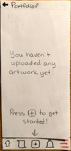
Fig. 6: a2a’s added empty portfolio page
The Importance of Neutrality
When conducting usability tests, we, the a2a team, had to keep in mind that our testers would be susceptible to the slightest visual cues we might give them. Our body language, even the slightest glances or reactions, could hint to the tester that they were doing something that we perceived as surprising or ‘wrong’. This is a problem that can arise in any type of interaction, from usability testing to contextual inquiries and research interviews. McNamara suggests in his “General Guidelines for Conducting Research Interviews” (link) that those conducting the research be as void of emotional reactions as possible, advocating for a “seen it all” attitude. He even says to mind the way one takes notes, so that the interviewee or tester does not use this as a hint that what they have just done or said is unusual.
Apart from interviewing and testing, the importance of neutrality carries into several other areas. One of these is prototyping. In the same vein as how little gestures can clue a tester in to an interviewer or facilitator’s reactions and impact their future decisions, polished-looking images as prototypes stick in users’ minds and impact their ability to evaluate the nitty-gritty of a design over the aesthetic of the graphics. This is why low-fidelity prototyping exists. These prototypes remove the aesthetic aspect of the design, allowing evaluators to focus on what does and does not work in terms of usability rather than visual prettiness (Rogers et al.). They also help both users and the designers maintain a neutral opinion toward any one iteration or a design. Making a design beautiful too early not only trips up the users, but also biases the designers to favor that form on which they spent so much time and effort.
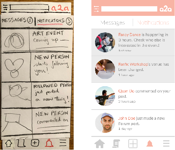
Fig. 7: low-fidelity prototype versus high-fidelity prototype
Another, more dangerous area where neutrality and bias have a huge impact is the way in which we program our technology. As was discussed in some of the ethics readings (machine bias) and in the ethics lecture, machines are only as smart the humans who program them, so if the humans give the machines a biased set of data, the machines will make biased decisions.
Face the Unforseen Consequences to which Your Product Contributed
As our technology progresses and impact society faster than the law can keep up with it, designers and computer scientists in general should strive to do no harm. Cases in which populations are harmed, intentionally or otherwise, due to a technology product or program are growing, and we the developers are the ones with the power to stop it. For example, there is a case where an algorithm is used to determine what type of healthcare a person should receive (link). Ever since the beginning of its use, it has made cuts that severely impact the quality of life for many, to the extent where some were hospitalized or could no longer live independently. In another case, Facebook carried out an experiment without consent on users by controlling how much positive or negative information they saw on their feeds (link). This manipulation of emotions had the potential to have a serious negative impact on users who received more negative information and were already in a delicate state of mind. Facebook responded by claiming that users had agreed to experimentation by using their product.
It is highly improbable that there will ever come a time when technology products no longer do harm to others. There are simply too many situations which take too long to become obvious for developers and designers to consider and make efforts to prevent them all. Thus, we as computer scientists need to be prepared to take responsibility for the wrongs our products have wrought and to work to improve them or change the culture around them. We may not be able to foresee that, say, the Mechanical Turk platform could become such a harsh and unregulated environment that for many is their main source of income (link). However, we can certainly respond by changing regulations to protect workers from abuse.
Conclusion
This past semester has not only honed our skills in researching, designing, and testing, but also allowed us to think more broadly about the power of technology and design, and their power to impact society. As computer scientists and designers, we want to make technology that is intuitive to use for as wide a user base as possible. This means considering more than just the average user and working to develop interfaces that integrate accessibility seamlessly with natural usability. We also must be aware that we will never catch all our oversights, and that we must rely on outside testers to help us find what we had not thought of. We must also remember the widespread power of neutrality and bias, from neutrality’s aid in interviews and testing, to bias’s control over impressions left by high-fidelity versus low-fidelity prototyping and the very data which we use to program our artificial intelligence. Finally, we must be ready to accept responsibility for the harm which our programs do and continue working toward doing no harm. These areas are some of the more important ones which should form and inform designs.